
CASE STUDY
8 Minute Read
Listing Card Redesign
Applying mixed methods research to support design iteration
CASE STUDY
8 Minute Read
Listing Card Redesign
Applying mixed methods research to support design iteration
CASE STUDY
8 Minute Read
Listing Card Redesign
Applying mixed methods research to support design iteration
Summary
About
Objective
Support the redesign of the product listing pages to make it easier to find important promotion-related information.
Outcome
Insights and recommendations from testing were incorporated into design iterations. The new interface was implemented on all applicable product pages in Singapore and Hong Kong.
Role
I contributed to this project as the sole UX researcher embedded in a product team. The work presented represents my individual contributions.
Skills Applied
Moderated usability testing, unmoderated usability testing
Ineffective Communication, Mismatched Expectations
MoneySmart regularly ran promotions featuring sign-up regards for transactions made through our platform. Unfortunately, poor experiences associated with the rewards redemption process lead to an influx of negative reviews and customer support requests.
To address this, the team set out to improve the our product listing card, which served as the central touchpoint for rewards-related information before and after purchase.
Previous research showed that ineffective communication of promotion-related information contributed to mismatched customer expectations about reward eligibility, redemption procedures, and timelines.
New Listing Card Design
Existing Design
To find reward eligibility conditions and redemption procedures, users had to:
Expand the listing card to reveal "more details"
Find the link to the T&C document for the promotion buried among other product-related information
Scan through a lengthy T&C document (a Google Doc) that was not optimized for mobile, and could be up to ten pages long
This cumbersome set up was due to structural limitations of the existing listing card, which was designed to display relatively stable product information, not frequently changing campaign details. This drove teams to employ workarounds such as inserting links to externally hosted files via the CMS fields they did have control over.

The existing listing card design
The existing listing card design
The existing listing card design
New Design
Drawing on insights from previous research, our designer prototyped a new listing card design that aimed to improve the prominence and accessibility of promotion-related information and resources. Key changes included:
Adding dedicated sections for displaying important redemption procedures and eligibility conditions, and moving them to the top of the expanded card
Adding four prominent buttons that linked to relevant rewards-related resources
Imposing a character limit in the promotion banner to reduce clutter
The new buttons linked to:
All T&Cs: The full terms and conditions document
FAQ: Our newly launched help center page
Claim Form: The relevant claim form for the promotion, which users had to submit to redeem their rewards
Email Instructions: A proposed new feature that enabled users to receive redemption instructions by email

The proposed new listing card design
The proposed new listing card design
The proposed new listing card design
Testing strategy
To support the evaluation and refinement of the proposed changes, I proposed two modes of user testing:
Moderated usability testing with smaller sample sizes would allow me to observe and probe participants as they interacted with the prototypes, enabling me to capture "thicker" data that was more actionable for informing design iterations
Unmoderated usability testing with larger sample sizes would serve more evaluative purposes due to standardized administration and measurements, and permit the use of statistical analyses for greater confidence in the generalizability of results
Moderated Usability Tests
Test Design
8 participants who had not recently applied for a credit card were recruited through MoneySmart's Facebook page. I randomly assigned participants into 2 groups who were exposed to either the existing or new listing card design. Other than the stimulus, all other aspects of the tests were identical.
I took participants through the following test sections:
Awareness test: participants were briefly exposed to the page and asked about their recall of basic promotion details immediately after. This was inspired by the "5-second testing" method.
Comprehension test: participants were asked to scroll through the page without time restriction, and asked about their understanding of promotion mechanics after. This approach was inspired by copy testing methods used in market research.
Usability test: participants were given a scenario where they assumed the role of a prospective customer. They were asked to retrieve important promotion-related information (e.g. "when could you expect to receive your reward?") and observed as they were doing so. After completing each task, I asked about their understanding of the promotion mechanics, and to rate the difficulty of finding this information. I also asked follow-up questions to notable observations at this time.
Interview: participants were asked about their perceptions of certain aspects of the promotion, such as how they felt about the waiting times, their preference for status updates, etc.
The test aimed to compare the old and new versions on the following dimensions:
Memorability: Does the interface support the visibility and recall of promotions?
Comprehension: Does the interface support the understanding of important promotion-related information?
Usability: Does the interface support the easy retrieval of important promotion-related information?
Snippets from one of the sessions
Snippets from one of the sessions
Snippets from one of the sessions
Demo of awareness and comprehension tests (without instructions)
Demo of awareness and comprehension tests (without instructions)
Demo of awareness and comprehension tests (without instructions)
Analysis
To analyze the data, I watched the recordings and:
Transcribed participants' think-aloud monologues and responses to questions
Recorded my observations (e.g. what paths participants took while navigating through the site)
Scored performance for usability and comprehension tasks
Tabulated rating scale responses
Synthesized findings within and between conditions
Selected Insights
Compared to the existing design, the new design made it easier to find important promotion-related information. The newly added buttons to the claim form, T&C document, and FAQ also simplified navigation between touchpoints. However, participants did not interact with the "Email Instructions" button.
The tests also revealed interesting insights about users' perceptions of promotion terms and conditions:
While participants appreciated the summary bullet points, they still wanted to read the full T&Cs, which they found overwhelming and difficult to navigate
Some crucial eligibility conditions remained easily missed or not clearly defined
Uncertainty over their eligibility for the promotion negatively affected participants' perceived attractiveness of the promotion
Improved usability for the new design was evidenced by higher ratings of ease and lower counts of pages visited before finding the desired information.
Iterating on the Design
The improved usability of the new design as indicated by these early tests were promising. Based on the insights and recommendations, our designer:
Removed the proposed feature to request an email
Added tooltips to clarify definitions of terms that users found confusing
Iterating on the Design
The improved usability of the new design as indicated by these early tests were promising. Based on the insights and recommendations, our designer:
Removed the proposed feature to request an email
Added tooltips to clarify definitions of terms that users found confusing
Iterating on the Design
The improved usability of the new design as indicated by these early tests were promising. Based on the insights and recommendations, our designer:
Removed the proposed feature to request an email
Added tooltips to clarify definitions of terms that users found confusing

Final iteration of the design
Final iteration of the design
Final iteration of the design
Copy guidelines
The tests highlighted the importance of having eligibility conditions stated as unambiguously as possible.
I worked concurrently with a copywriter to develop copy guidelines for that took advantage of the new sections and addressed the feedback received during the tests.
Prior to this, promotion copy was not standardized and varied in clarity and completeness depending on who updated it. For example, crucial eligibility conditions were sometimes omitted, with customers expected to read the full T&Cs.
Unmoderated Usability Tests
Next, I conducted unmoderated usability testing to validate and extend to findings of the previous moderated tests with a larger sample.
For this round of testing, I also introduced a new dimension—campaign complexity—to explore the impact of increasingly complex promotion mechanics on outcomes (i.e. memorability, comprehension, usability).

Example of an actual "complex" campaign
Campaign complexity was operationalized with two levels:
Simple Campaigns: promotions with a single gift choice and relatively uncomplicated mechanics
Complex Campaigns: promotions with multiple gift choices and more complicated mechanics (e.g. refer a friend)
Test design
I used UsabilityHub to conduct the tests. Participants were recruited through posts made to MoneySmart's Facebook and Telegram accounts, and randomly assigned to one of four conditions as part of a 2x2 between-subjects design.
A total of 170 valid responses were received.
This was the team's first time utilizing specialized software for unmoderated tests. To facilitate this, I evaluated potential vendors, sought procurement approval, and onboarded the software.

Illustration of the test conditions
Depending on their assigned condition, participants saw screenshots of the listing card featuring either the old or new design, and either "simple" or "complex" campaigns.
All other aspects of the test were identical. Promotion details were taken from actual past campaigns.
During the test sessions, I guided participants through a series of questions and activities that aimed to measure a range of outcomes:
Memorability of promotions
Comprehension of promotion-related information
Attractiveness of promotions
Ease of finding and understanding promotion-related information
Clarity of promotion-related information
Comprehensiveness of promotion-related information
Likelihood to apply for promotions
In addition to typical attitudinal measurements, I also leveraged UsabilityHub's more interactive and behavioral tests, such as the 5-Second Tests and First Click Tests.

5-Second Test
Participants were briefly shown a screenshot featuring two listing cards and asked to recall the rewards featured for the first and second card. The actual exposure time was amended to 12 seconds after feedback from pilot testing.
5-Second Test
Participants were briefly shown a screenshot featuring two listing cards and asked to recall the rewards featured for the first and second card. The actual exposure time was amended to 12 seconds after feedback from pilot testing.
5-Second Test
Participants were briefly shown a screenshot featuring two listing cards and asked to recall the rewards featured for the first and second card. The actual exposure time was amended to 12 seconds after feedback from pilot testing.

First Click Test
Participants were shown a screenshot of a listing card and asked where they would click to find more information about the promotion, and what information they expected to find. Click maps were recorded by the system.
First Click Test
Participants were shown a screenshot of a listing card and asked where they would click to find more information about the promotion, and what information they expected to find. Click maps were recorded by the system.
First Click Test
Participants were shown a screenshot of a listing card and asked where they would click to find more information about the promotion, and what information they expected to find. Click maps were recorded by the system.
Demo of the whole test
Demo of the whole test
Analysis
I used Google Sheets and Jamovi to analyze the quantitative data, producing descriptive statistics, data visualizations, and running hypothesis tests (t-test, chi-square test, correlation analysis).
I analyzed the qualitative data in Miro, applying thematic analysis techniques to uncover salient themes.
Selected Insights
The unmoderated tests extended previous findings about the improved usability of the new design, while also highlighting its limitations and potential areas for improvement.
I communicated the findings to stakeholders through a presentation and report. The presentation slides are reproduced below:
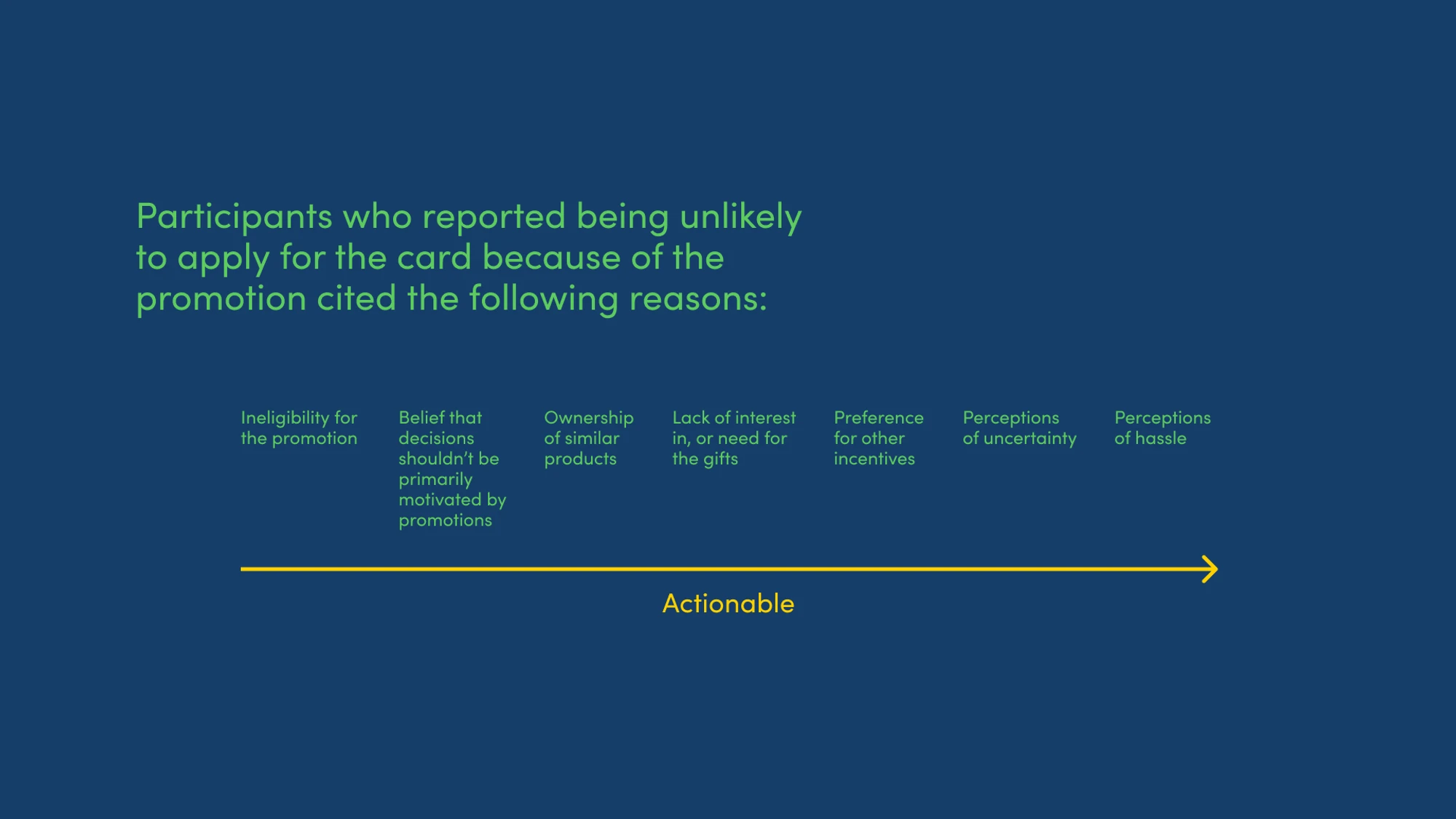
The findings also shed light on potential customers' other information needs, and the variables that affect perceived promotion attractiveness.
Selected Insights
The unmoderated tests extended previous findings about the improved usability of the new design, while also highlighting its limitations and potential areas for improvement.
I communicated the findings to stakeholders through a presentation and report. The presentation slides are reproduced below:
The findings also shed light on potential customers' other information needs, and the variables that affect perceived promotion attractiveness.


Next Steps
Recommendations
Some of the qualitative insights uncovered by the tests were quite subtle and easy to overlook without hearing from users. For example, simply omitting to state explicitly that no minimum spend was required resulted in uncertainty among users, which in turn affected the perceived attractiveness of the promotion.
As such, I recommended continuing to iterate on our product comparison touchpoints through a user-centered process.
Outcomes
The new interface was implemented on all applicable product pages in Singapore and Hong Kong.
Outcomes
The new interface was implemented on all applicable product pages in Singapore and Hong Kong.
Outcomes
The new interface was implemented on all applicable product pages in Singapore and Hong Kong.
My Takeaways
Through the project, I collected and analyzed a variety of qualitative and quantitative data, such as:
Interview transcripts
Observation notes
Click maps
Rating scales
Fixed-choice responses
Open-ended responses
This experience affirmed my confidence in taking a mixed-method approach and combining the strengths of both small- and larger-scale testing in future projects.